Imagine walking into a room and instantly commanding attention. That's the power of colour! We all experience this with fashion, but have you considered the same impact for your printed materials?
Colour theory isn't just for stylists; it's a design superpower waiting to transform your brochures, flyers, and more. By harnessing this power, you can create printed pieces that not only look amazing but also resonate with your audience and leave a lasting impression.
What is Colour Theory?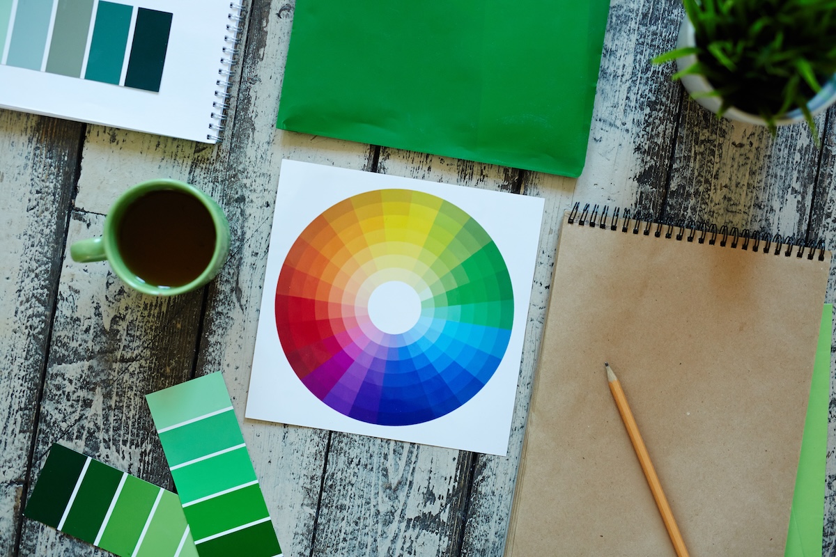
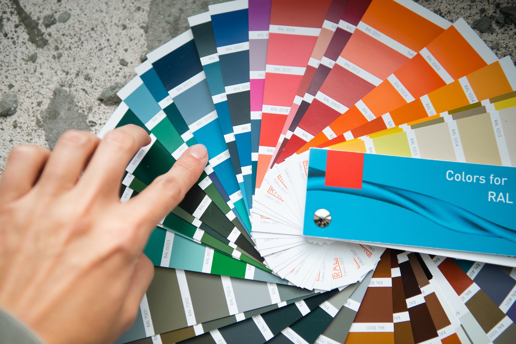
Colour theory is the study of how colours interact, how they make us feel, and how they can be combined to create harmonious designs. At its core, it involves the colour wheel, which was first developed by Sir Isaac Newton in 1666. The colour wheel is a circular diagram of colours arranged according to their chromatic relationship. Primary colours (red, blue, yellow) are the building blocks, and from these, secondary and tertiary colours are derived.
The Basics of Colour Harmony
Harmony in colour is about creating balance and order. There are several schemes designers use to achieve harmony:
Complementary Colours
These are colours that are opposite each other on the colour wheel (e.g., red and green or blue and orange). When used together, the colours look brighter.
Analogous Colours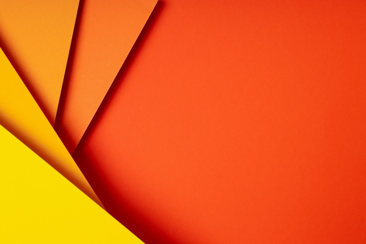
These are colours that sit next to each other on the colour wheel (e.g., red, orange, yellow). To add depth and interest to your design, vary the saturation (intensity) and brightness (lightness or darkness) of the analogous colours to prevent your design from looking flat and one-dimensional.
Triadic Colours
This scheme involves three colours evenly spaced around the colour wheel (e.g., red, yellow, and blue or green, orange, purple.). This provides high contrast while retaining harmony.
Monochromatic Colours
This scheme uses variations in lightness and saturation of a single colour. It’s a simple yet effective way to create a cohesive look.
The Psychology of Colour
When selecting colours for your next printing project, it’s important to keep in mind the psychology of colours as well and how they will work with the message you are trying to convey. Here’s how some common colours are perceived:
● Red: Excitement, passion, danger
● Blue: Trust, calm, professionalism
● Yellow: Optimism, energy, attention
● Green: Growth, health, tranquillity
● Purple: Luxury, creativity, mystery
● Orange: Enthusiasm, warmth, caution
● Black: Power, elegance, sophistication
● White: Purity, simplicity, cleanliness
Bringing Colour Theory to Life in Your Print Design
Colour theory isn't just theory; it's a practical tool to elevate the impact of your printed marketing materials. Here's how to put it into action:
- Brand Champion: Maintain colour consistency across all your printed pieces, from business cards and brochures to booklets and flyers. This visual cohesion reinforces your brand identity and makes you instantly recognisable.
- Know Your Audience: Consider the emotional response you want to evoke in your target audience. For example, if you're targeting professionals, a palette of blues and greys might convey trust and competence. Conversely, a daycare centre brochure might benefit from playful and triadic colours.
- Readability First: Ensure high contrast between text and background colours for effortless reading. This is especially important for brochures with lengthy content or booklets with fine print.
- Spotlight the Stars: Use colour strategically to draw attention to crucial elements like calls to action (CTAs) on flyers or important contact information on business cards. A contrasting colour for your CTA will make it stand out and encourage interaction.
- Seasonal Shift: Embrace seasonal colour palettes to make your printed materials more relevant and engaging. For instance, pastels evoke springtime freshness, while rich reds and greens create a festive Christmas vibe for brochures or greeting cards.
By harnessing the power of colour theory, you can elevate your printed materials from ordinary to extraordinary. From business cards and brochures to flyers and posters, colour theory empowers you to craft designs that are not just aesthetically pleasing, but strategically designed to achieve your communication goals.
At Inteliprint, we’re here to help you make the most of colour theory in your print projects. Contact us today to discuss how we can bring your vision to life with beautifully designed, custom-printed materials.